Note
Click here to download the full example code
Visualize cell fractions
This example demonstrates how to generate celltype quantification plots. These types of plots can be used to visually represent the number of cells that belong to a certain subset or condition.
import besca as bc
import pytest

# pytest.skip('Test is only for here as example and should not be executed')

# import dataset to workwith
adata = bc.datasets.Peng2019_processed()
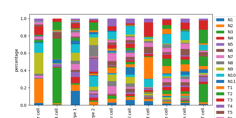
quantify specific celllabels as a stacked barplot
bc.pl.celllabel_quant_stackedbar(
    adata, count_variable="Cell_type", subset_variable="Patient"
)
<AxesSubplot:ylabel='percentage'>
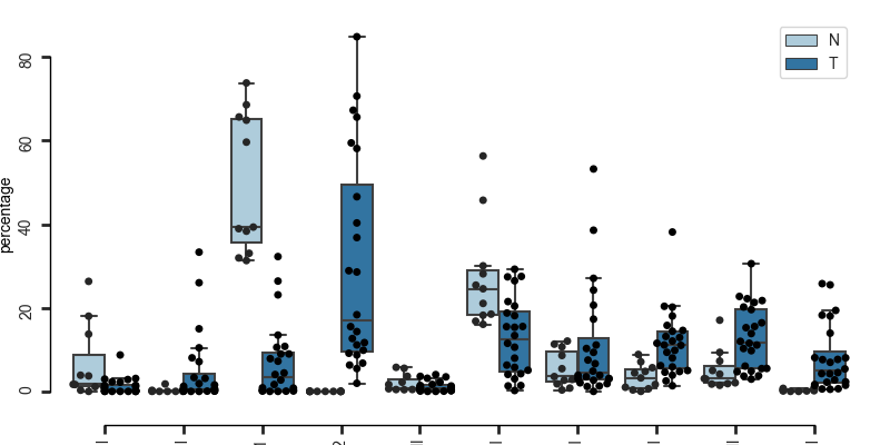
quantify number of cells belong to each condition in a specific subset
here each dot represents one Patient, the boxplots are grouped according to tissue type (Normal or Tumoral)
bc.pl.celllabel_quant_boxplot(
    adata,
    count_variable="Cell_type",
    subset_variable="Patient",
    condition_identifier="Type",
    plot_percentage=True,
)
<Figure size 800x400 with 1 Axes>
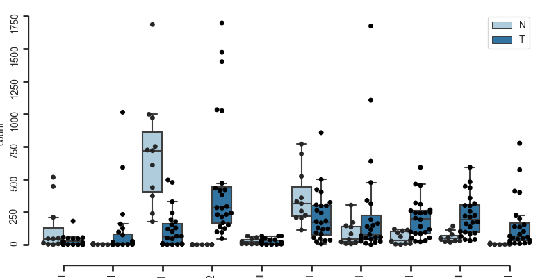
here you can also choose to plot total counts instead of percentages
bc.pl.celllabel_quant_boxplot(
    adata,
    count_variable="Cell_type",
    subset_variable="Patient",
    condition_identifier="Type",
    plot_percentage=False,
)
<Figure size 800x400 with 1 Axes>
Total running time of the script: ( 0 minutes 59.225 seconds)